
Starting today, you'll see a refreshed HeyMax: new colours, a new logo, a new feel across the app.
This is the first of a set of changes we're rolling out over the next few months. The goal behind all of them is simple: make it easier for you to earn Max Miles, and easier to turn them into an actual trip, sooner than you'd expect.
Here's what the new look changes for you, and a little of the thinking behind it.
First, the part that matters most
Nothing about your miles has changed. Your balance, your linked cards, your bookings and your rewards are exactly where you left them. We haven't touched how you earn or what your miles are worth, either.
The app looks different. Your miles don't.
What's different for you

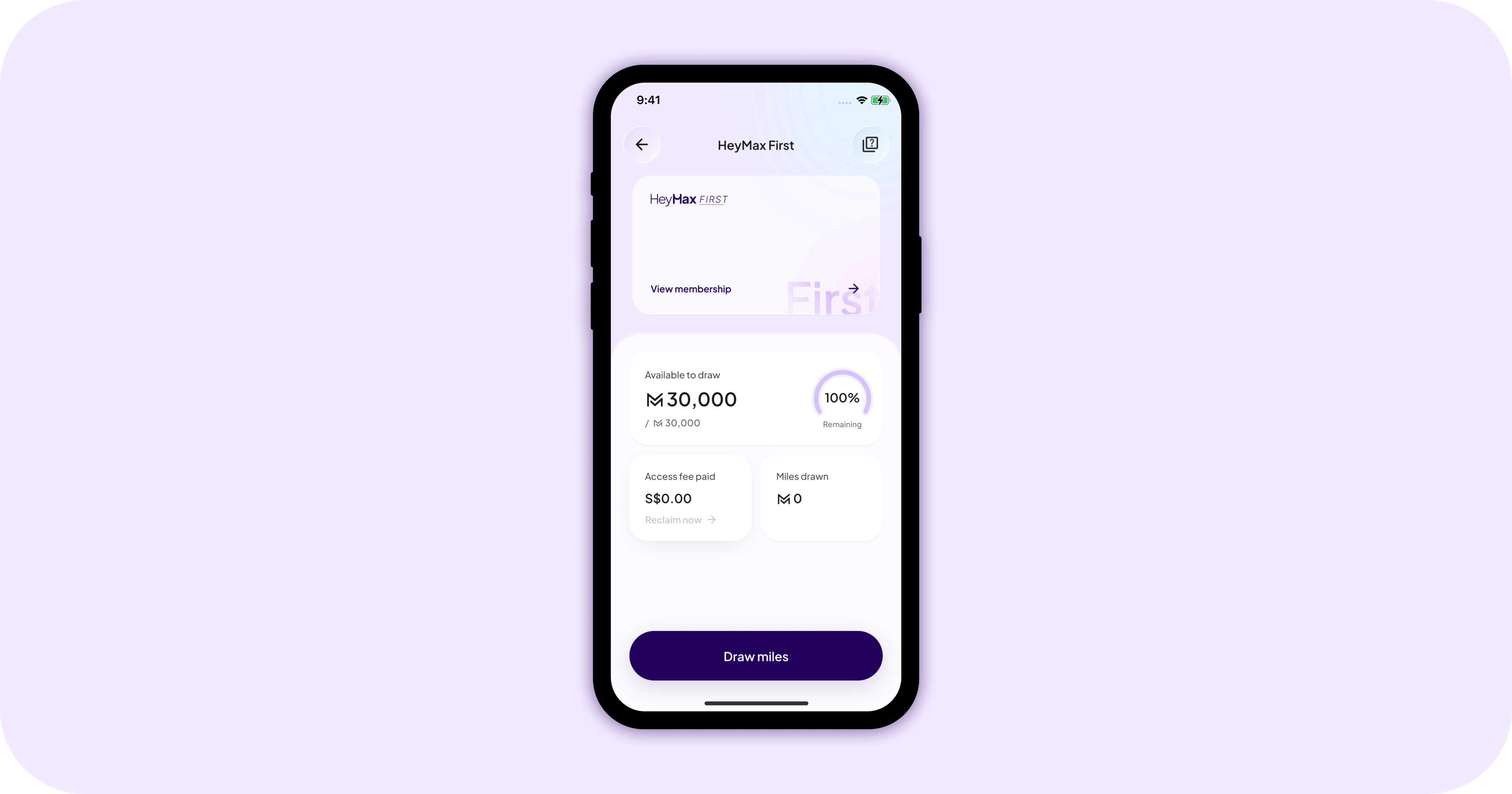
Your homepage now shows available miles, not lifetime miles. Lifetime is a nice number. It's also not a number you can do anything with. You told us the balance that matters is the one you could spend today, on a flight you could actually book — so that's the one we lead with now.
If it looks smaller than the number you're used to, don't worry: nothing was taken away. Your lifetime total is still there - tap “Available miles” or head to your profile to see it, along with all your recent transactions. And with HeyMax First, the pool you can actually reach is bigger than it used to be. More on that below.
Your cards are easier to find. The cards button used to sit small in the top corner, and too many of you never found it. Now it's front and centre, along with the maximiser that tells you which card to pay with, so every dollar earns what it should.
Changes like these come straight from your feedback, and make the app a little less work to use, which is the whole point. More will keep landing over the next few months.
Why the new look

We had the pieces. You could earn miles, book travel, and redeem. Each part worked on its own, but nothing carried you from one to the next, and the app felt like a record of what you've done instead of an invitation to go somewhere.
What was missing is the loop. You spend the way you already do. That becomes Max Miles. Max Miles become a trip. Same pieces, one loop, and the new design is built around it.
You'll see it in the new M. It's drawn as a runway, the last stretch of ground before a plane takes off. Look again and it's two people shaking hands, because you get there through merchants who reward the spending you were already doing. One shape, both halves of HeyMax. If the whole refresh had to fit in one icon, that's it.
It's also why the app now looks toward the horizon. The reason you're here isn't the miles. It's the place at the other end of them.
Already live: HeyMax First

A new coat of paint doesn't get anyone on a plane, so it's worth saying that the most important piece is already here.
The usual deal with miles is that you save for years, watch a number go up, and go somewhere eventually. The reward is real, but it's always later. You end up being patient about your own holiday.
HeyMax First flips the usual deal with miles. Get the miles now, fly now, and the spending you were already doing pays it forward. It's the clearest version of what we mean by sooner — and it's the reason the new look leads with a runway instead of a wallet, and it’ll get its own post soon.
How we did it
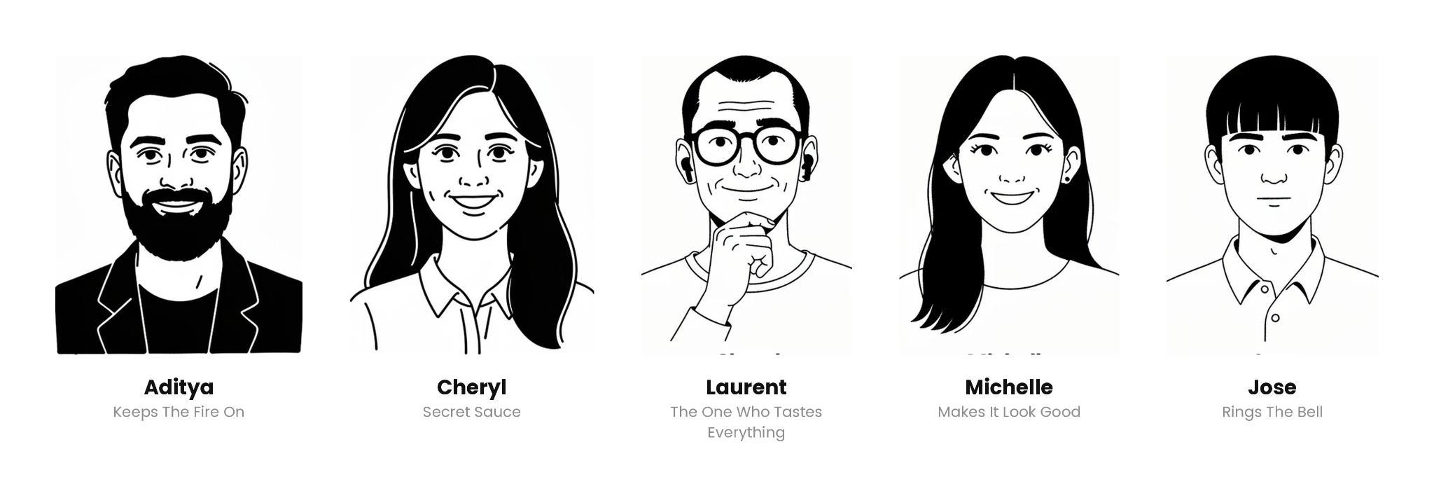
No agency, no big committee. Just a small team in one room, working through it step by step: look at everything, cut what isn't needed, agree before moving on.
Every choice ended with the same question: does this make the trip feel closer? If the answer was no, it didn't ship.
The hard part was never the logo or the colours. It was the hundreds of small decisions nobody outside the room will ever see, made properly. That was Laurent, Cheryl, Michelle, Aditya and Jose. This refresh is their work.
This is a start, not a finish
The new look is the part you can see. The rest is still coming, and most of it will come from listening. If something still feels harder than it should be, tell us — that's the list we're working from.
Next up: the design story behind the new HeyMax